The Solution To Getting Rid Of Millennial Gray Is Switching To This Warm Earthy Design Trend
We may receive a commission on purchases made from links.
Is your boring beige room giving you the blahs, but you’re not entirely onboard with the maximalist trend? Do you love the cozy, comfortable vibes created by Scandinavian hygge decor, but also find yourself drawn to the weathered, wabi-sabi beauty found in Japanese design? If you are dying to ditch the gray and try trendy new colors, but still want to create a harmonious and serene style in your home, one home improvement expert says it’s possible when you lean into Japandi style. Mary Peters, founder and CEO of Sasquatch Contracting, says the solution to getting rid of millennial gray is to embrace earthy color schemes and natural fabrics that add texture.
“Millennial gray became the go-to neutral for nearly a decade because it felt modern and safe,” Peters told House Digest during an exclusive interview. “But now it’s beginning to feel a little sterile. It doesn’t bring a lot of warmth or personality into a space, which is something people are really craving.” She explained that trends are moving toward warmer color schemes associated with Japandi style. Peters attributes this not just to people wanting their spaces to feel warmer and more personal, but to Pantone’s 2025 Color of the Year, a moody brown hue called Mocha Mousse. “Instead of cool grays that can feel flat or cold, earth tones, like beiges, taupes, rich browns, and soft terracottas … make a home feel lived-in and soothing.”
Use color, lighting, and texture to create Japandi style in your spaces
“I would recommend using Japandi design and associated color palettes to update millennial gray spaces,” Mary Peters told House Digest during her exclusive interview. “The trend helps us get away from ‘showroom perfect’ and staged real estate listings, and more towards spaces that feel like a personal sanctuary,” she explained. She’s not alone in her assessment. Many interior designers agree that millennial gray is among the design trends that are officially going out of style.
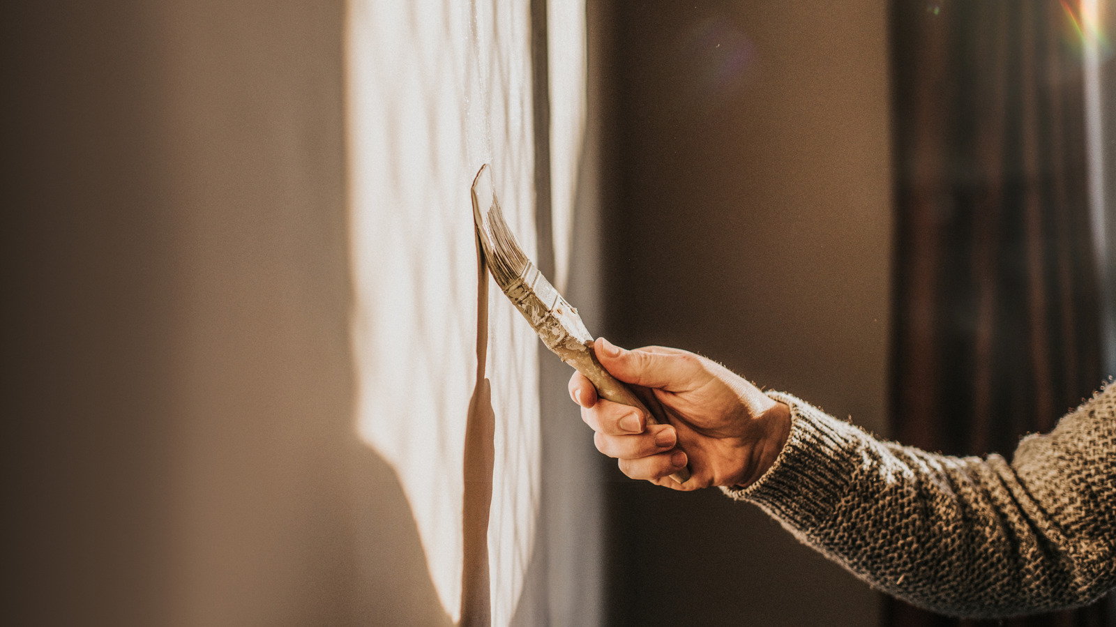
Getting Japandi style just right requires a careful mix of furniture, accessories, lighting, and texture. But according to Peters, it starts with getting the right color on your walls. “Painting is a great first step,” she told us. “Some colors that I like a lot are Shoji White, Fawn Brindle, Urbane Bronze, Weimaraner, and Revere Pewter.” Most of these iconic neutrals have low or mid-range light reflectance values (LRV), which can help to create a good balance between light and warmth. Peters said the lighting you choose can amplify this effect. “Swap out cool white light bulbs for soft white to keep out harsh shadows and cold tones,” she suggested.
Textiles are another way you can add these warm, earthy colors to your space. Peters said to try an area rug if you’re looking for a quick solution. “Using natural fabrics like wool add texture and warmth,” she added. Available in beige and brown, the SAFAVIEH Natura Collection Handmade Premium Wool Rugs are highly-rated options that reviewers describe as warm and cozy.
Add contrast with natural materials
Although you’re unlikely to regret updating your outdated millennial gray space with warmer colors that are more on trend, according to Mary Peters the change offers both pros and cons. “A warm, earthy palette can feel calm and grounding,” she said during her exclusive with House Digest. “Think clay, sand, ochre, and soft beiges; they add warmth and a sense of intention to a space.” Peters also appreciates the versatility of Japandi color palettes, adding that “you can layer textures, add natural materials like wood or stone, and still keep a cohesive look.” Keep in mind that this perfectly imperfect decor style works best when you approach it holistically.
According to the general contractor, cohesion and balance are the keys to getting this look just right. “If you go too heavy on one tone without enough contrast, a room can start to feel a bit flat,” she cautioned. Peters encouraged playing with texture and depth to keep things more interesting. She told us spending a little extra time on thoughtfully designing your space with all the elements in mind is well worth the effort, not just because of the aesthetic impact but because of the mental and emotional benefits it can bring as well. “I think this palette is both timely and timeless,” Peters said. “It’s having a moment right now because it’s such a visual palate cleanser after years of gray, but the reason it’s catching on is because it makes people feel good in their space.”