These Two Paint Colors Will Camouflage The Ugliest Corners Of Your Yard
What if there were a way to hide that terrible eyesore in your backyard with just a simple coat of paint? You know, that utility box, old fence, or rain barrel that sits in a corner, looking so out of place. Well, there are two paint colors that could make you forget all about them. One is a particular shade of green, and the other is a type of blue. There is nothing magical about them; they’re just really good at tricking the eye to make these ugly corners of your yard blend into the background.
These two colors, called “Go Away Green” and “Blending Blue,” were popularized by Walt Disney’s resorts. Throughout their theme parks, the brand used these two colors to camouflage buildings and infrastructure that don’t belong in the fantasy. They use them for buildings, fences, fire hydrants, and even trash cans. It’s like photoshopping reality and cropping things out, just with some simple paint.
While you can’t buy Disney’s signature paint colors, there are plenty of paint hues on the market that can have the same effect. The idea is to find the right tone that will make things in your yard disappear into the foliage or the sky. Whether you want to paint an ugly shed in the back of your yard or some exposed pipes, there’s nothing you can’t disguise with these two paint colors. Just make sure to check first what type of paint and primer to use for the material, whether it’s metal, plastic, or wood. Some paints are better suited to prevent rust or last longer under tough weather conditions.
How to use Go Away Green in your yard
Go Away Green is a color that’s both muted and earthy. It’s a type of green that’s not saturated and almost gray – similar to the camouflage green used by the military. One reason this type of green works in camouflage is because of its neutral and organic tones, which the eye associates with foliage and nature. But that’s not the whole story. A more saturated, brighter green might better match the color of shrubs and trees, but it could also reflect light more. Instead, Go Away Green, with its gray and blue undertones and muted green look, is considered a medium dark color, which does not reflect as much light. As a result, you’re more likely to miss it, even on a sunny afternoon in the yard.
Go Away Green paint colors exist in tons of finishes and for all sorts of materials, but matte finishes usually work best. As opposed to satin and shiny paints, matte paints absorb light instead of reflecting it. This will make your camouflage paint job even more effective.
Go Away Green doesn’t refer to one single color; rather, it’s a type of green that you can find in several hues. Sherwin-Williams sells a few options that mimic Disney’s signature Go Away Green, like ‘Taiga’ and ‘Gallery Green.’ Benjamin Moore has a light green, ‘Aganthus Green,’ or ‘Southfield Green’ for a slightly bluer hue. The key is to look for something with a low Light Reflectance Value (LRV) in the 20 to 30 range, similar to camouflage green. These work great for fences that blend into trees, pipes running along grass, or trash bins near shrubs.
Using Blending Blue to make things disappear
In addition to Go Away Green, Disney also uses a shade of blue to make ugly things disappear from its parks. Blending Blue is a paint color that was designed to blend into the sky rather than foliage. Blending blue, also unofficially called ‘Bye Bye Blue,’ is used on large buildings that would otherwise stand out on the horizon. Thanks to this tone of blue, even large and bulky buildings manage not to take over the skyline and draw any attention to themselves. There isn’t just one Blending Blue hue — Disney changes the paint it uses based on the color of the sky in different locations.
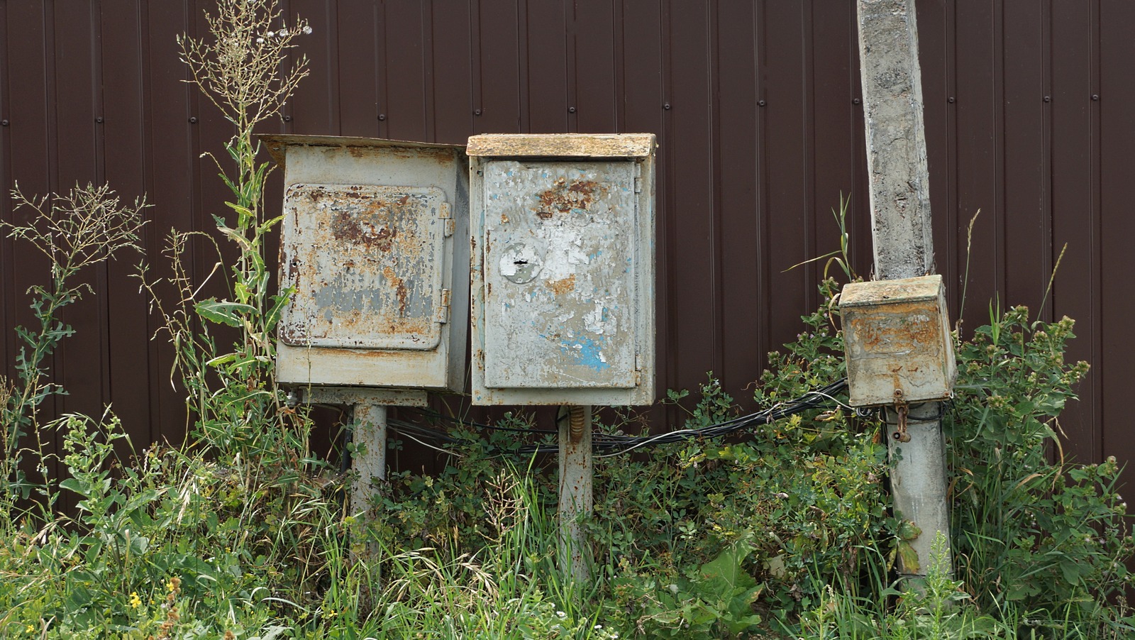
So, can you use Blending Blue in your yard even if you don’t have a gigantic warehouse to hide? Of course! For example, Blending Blue works wonders on a shed, fence, poles, and even electrical and utility boxes. The key is to look at what you’re trying to conceal and decide whether it’s more likely to blend into the sky or foliage. If the sky is the answer, then look for light blue paints.
The exact paint you use will depend on the weather where you live, but you’ll want to stay away from blue paint shades that are dark and moody. In bright and sunny Florida, baby-blue shades like Dunn-Edward’s ‘Worn Denim’ and Valspar’s ‘New Day’ would work wonders. In areas where clouds and overcast are more common, consider grayer alternatives like Glidden’s ‘Keepsakes.’ Lighter colors reflect more light and have a higher LRV. If you’re worried about sun reflection, go a little bit darker, to something like Sherwin-Williams ‘Cosmos.’