HGTV’s Mike Holmes Thinks One Kitchen Color Scheme Is Always A Great Choice
With decades of experience and hundreds of home renovations under his belt, Mike Holmes has seen it all throughout his time as a professional contractor. He’s tackled plenty of space in need of major upgrades, and through it all, he’s gained a strong understanding of what does and doesn’t work when it comes to home design. If you’ve been considering a refresh in your space, the HGTV star has many top recommendations for a kitchen remodel that are worth considering. He’s also shared his thoughts on the ideal color scheme for kitchen spaces — a neutral foundation like classic white, with some thoughtful elements that add a pop of color.
As bold palettes are rising in popularity, you may be tempted to ditch the gray paint and try some trendy colors, but before you start adding vibrant colors to every inch of your kitchen, it may be helpful to think about Holme’s advice. A neutral color scheme can benefit your kitchen greatly, creating a timeless appeal that easily complements small yet impactful uses of color. It’s a tried and true approach that can not only withstand shifting trends but is also easy to incorporate in your own kitchen design. The kitchen is the heart of the home, so it’s important to build a look you can love for years to come.
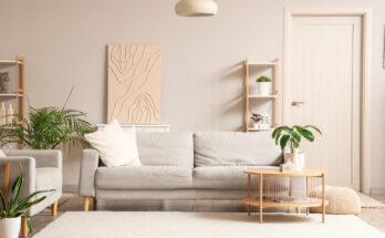
Stick to a neutral palette with colorful accents
A neutral color scheme for the kitchen doesn’t need to be boring — it actually sets the perfect backdrop for more playful details. Holmes notes that you can never go wrong with a classic white kitchen, and designers agree that a white kitchen offers a clean, sleek look that contributes to a more refreshing aesthetic. To use it as a basis for your color scheme, incorporate some light, airy neutrals among countertops, cabinets, and walls in your paint or material choices. You can also get creative amongst your neutrals to get the right style, like opting for creamy whites for a cozier look, or pairing white with beige for an extra sense of warmth. What’s great about a palette that is dominant in neutrals is that it allows for more versatility among your accent colors and builds an atmosphere that feels both fresh and welcoming.
In a neutral kitchen, even the smallest doses of vibrancy create contrast and emphasize some colorful character. There are endless ways you can do this in your space, from bold-colored accent lights and statement seating to indoor greenery. You may even want to try out the kitchen trend that’s adding a playful pop of color where you’d least expect it — your pantry. You can play around with the amount of color you want to add as well as its intensity, giving you the freedom to build a subtle or standout color story within your classic, neutral kitchen design.